Think back to the last time you walked into a store and felt instantly drawn to a product on the shelf. Maybe it was the bold red packaging that screamed urgency. Or the calming blue that whispered trust. You didn’t consciously analyze it. You just felt it. That’s color psychology at work.
In the print world, color isn’t just decoration. It’s the difference between a brand that is forgettable and one that creates an emotional connection. This guide breaks down the psychology behind colors and the feelings they evoke.
Ready to master colors and their symbolism? Let’s go.
Color psychology is the study of how colors influence human behavior, emotions and decision-making. It’s the science behind why certain hues energize us while others calm us down.
At its core, color is a powerful, silent language. It communicates without words, triggering emotional responses before a customer reads a single word. A splash of red can accelerate a heartbeat. A wash of blue can lower stress levels. These aren’t just abstract concepts. They’re measurable reactions rooted in both biology and cultural conditioning.
For print professionals, understanding emotional color theory means you’re not just pushing ink onto paper. You’re crafting experiences and helping your clients build brands that drive loyalty and action.
Getting color right isn’t just about aesthetics. It’s about business impact.
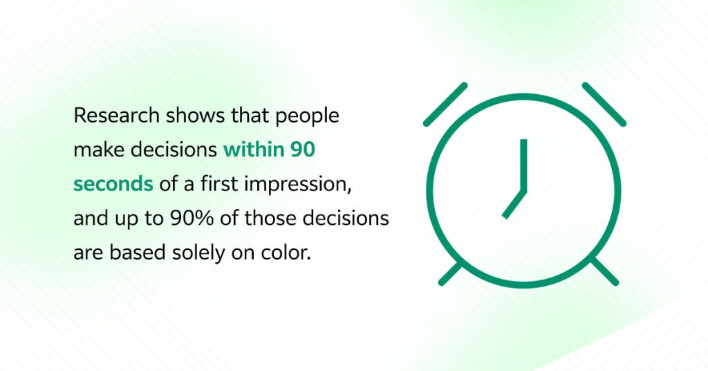
Research shows that people make decisions within 90 seconds of a first impression, and up to 90% of those decisions are based solely on color. That’s a staggering statistic. It means the colors you print today could be the reason your client’s product flies off the shelf tomorrow or gets ignored entirely.
Strategic color choices deliver tangible results across three critical areas:
Want a quick reference guide you can keep handy? This color psychology chart summarizes the core emotions and common uses of each color at a glance. Whether you’re consulting with a client on brand direction or making split-second decisions on press, this color emotions chart gives you the essentials.
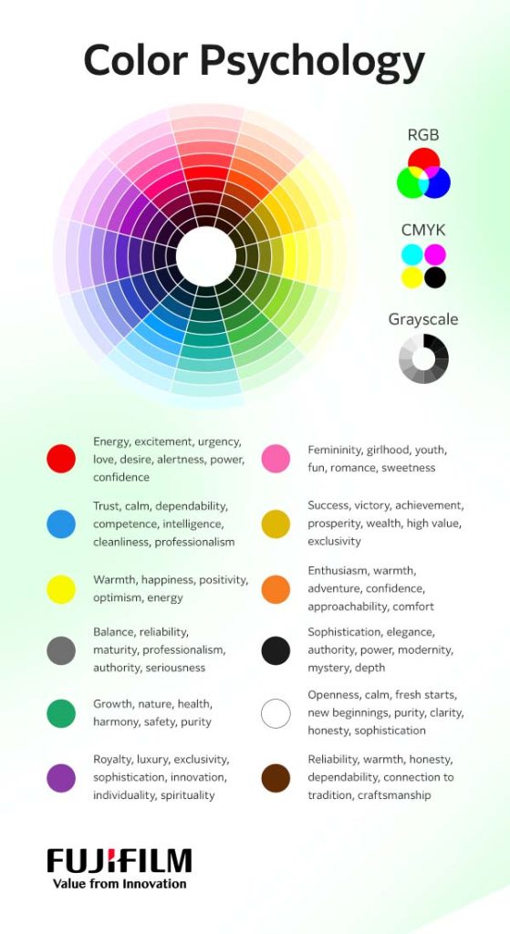
Now that you understand why color matters, let’s explore what colors symbolize. The following sections break down the most common colors and the emotions they evoke, giving you the insights you need to guide your clients toward strategic choices.
This color doesn’t whisper. It screams energy and excitement. Red symbolizes love and desire, yes, but it also signals alertness. It’s the color of stop signs and fire trucks. It is impossible to ignore and is designed to demand immediate attention.
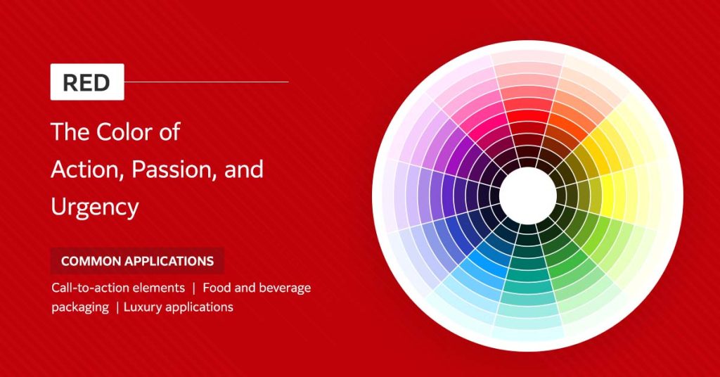
What does the color red represent in branding and design? Power. Confidence. Urgency. Depending on your client’s industry, a rich, deep red can convey luxury and boldness. Think premium automotive brands or high-end cosmetics. Bright, vibrant reds lean toward immediacy, perfect for clearance sales or anything designed to inspire quick action.
Strategic uses of red in print design include:
If red is the extrovert of the color wheel, blue is the steady, reliable friend everyone counts on. It’s the color of clear skies and calm oceans, making it inherently soothing and dependable. While it’s praised for its calmness, blue is also known as the color of sadness in some cultures.
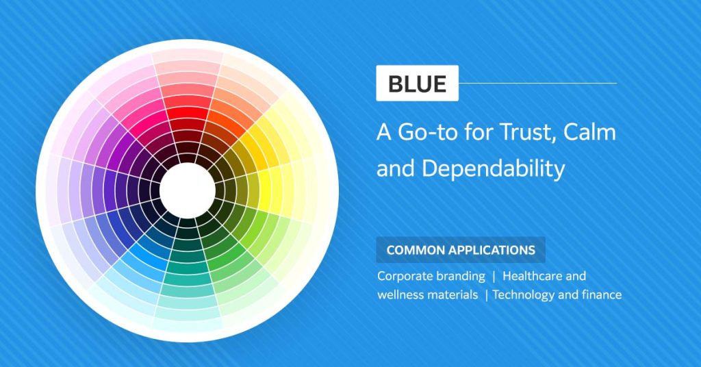
Blue represents competence, intelligence and cleanliness. Little wonder financial institutions, healthcare providers and tech companies lean heavily on blue to communicate stability and professionalism. Lighter blues symbolize tranquility and openness, while deeper navy tones convey authority and expertise. It’s a versatile color that works across industries.
Yellow represents warmth, happiness and positivity. Think of it as the hue of optimism and energy that grabs attention almost as effectively as red, but with a friendlier vibe. Wondering about colors that make people happy? Yellow tops the list. You can call it the color of happiness.
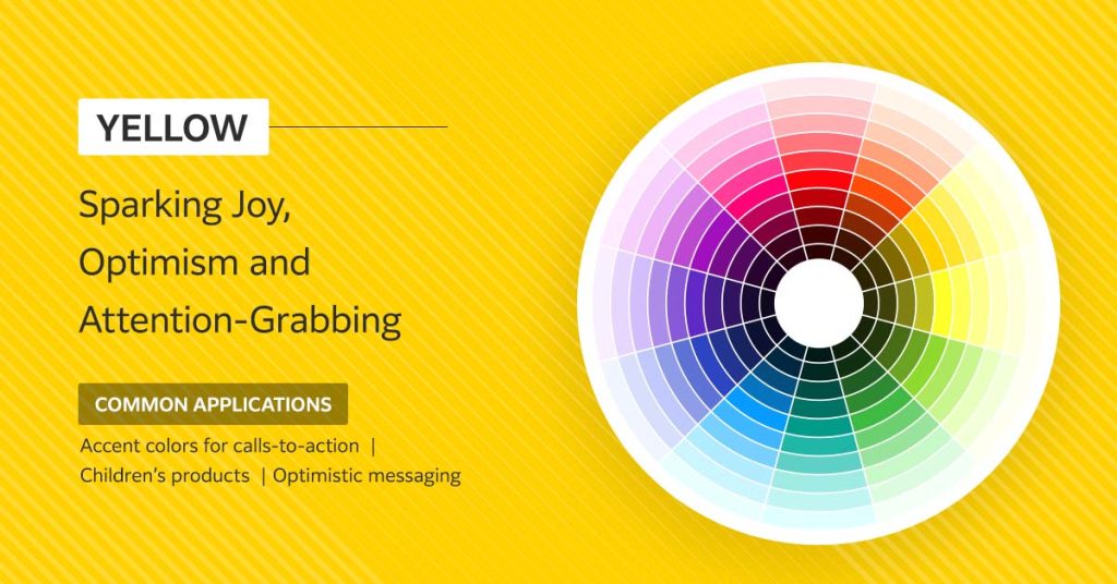
Common applications for yellow include:
You should know that yellow can fade in print if you’re not using high-quality, fade-resistant inks. Certain yellows are particularly susceptible to light, which can dull their vibrant, joyful impact over time. Choosing the right materials ensures your client’s sunshine stays bright.
As a perfect neutral, gray can serve as a sophisticated backdrop that lets other colors shine, or it can stand confidently on its own to convey maturity and timeless professionalism.
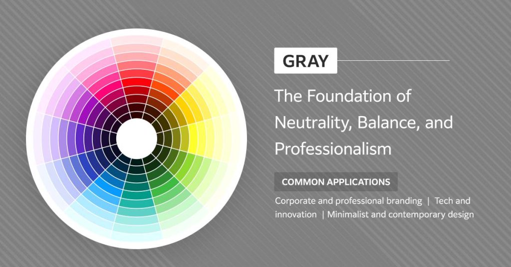
The color gray represents balance and reliability. Charcoal and slate tones convey authority and seriousness. The key is using gray strategically, often paired with pops of color or rich textures to add visual interest.
Gray’s most versatile applications include:
Green is the color of life, renewal and possibility. Associated with nature, health, wealth and tranquility, green symbolizes growth in every sense. It’s the color of fresh starts and thriving ecosystems, which is why it dominates eco-friendly branding. But green is also representative of money, making it a natural fit for financial services that want to communicate prosperity.
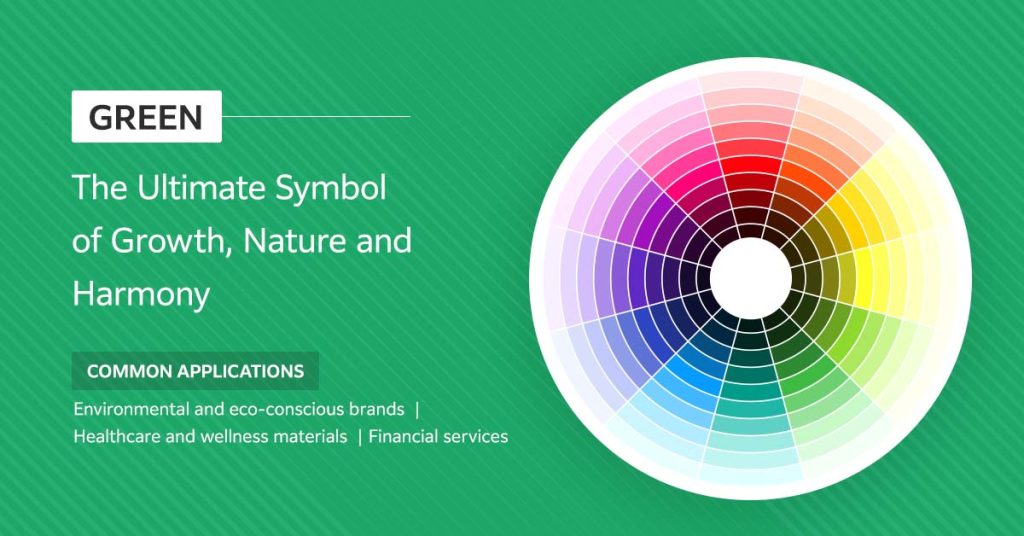
This rich color conveys health, harmony and safety across industries. It’s one of the most versatile colors in the spectrum, capable of expressing everything from organic purity to high finance depending on the shade you choose.
You’ll see green making an impact in the following applications:
Purple has always been the color of kings, queens and visionaries. Historically, purple dye was so rare and expensive that only royalty could afford it. That association with luxury, power and exclusivity persists today. But purple symbolism goes deeper. It’s also the color of creativity, wisdom and spirituality. It invites contemplation and imagination.
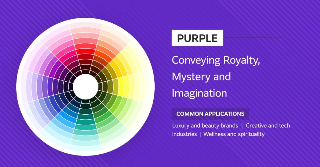
The color purple represents sophistication, innovation and individuality in modern branding. Purple is a blend of calming blue and energetic red, embodying a balance between the two. Like all colors, moderation and thoughtful application are key.
These brands and industries often leverage the richness of purple:
Traditionally, pink symbolizes youth, fun, romance and sweetness. In some cultures, it is strongly associated with femininity, girlhood and love. But modern branding has pushed pink into new territory. Today, pink can be bold, confident and even subversive. Think hot-pink tech startups or millennial-targeted brands that use blush tones to convey calm sophistication.
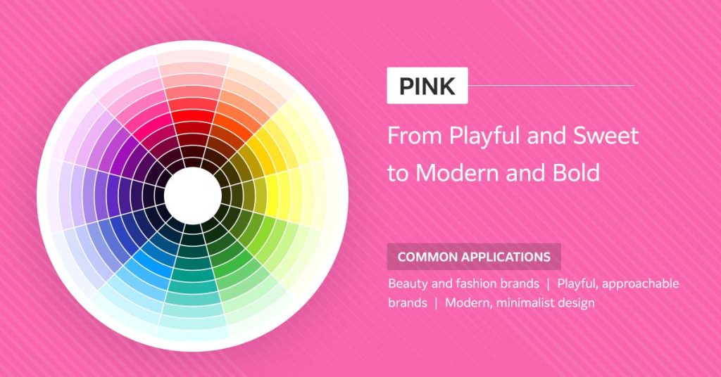
What pink represents depends entirely on context. Soft, pastel pinks symbolize gentleness and nurturing. Vibrant magentas radiate energy and confidence. Dusty rose tones feel modern, minimalist and upscale.
You’ll typically see pink in action in:
Gold represents success. This is the color of victory, achievement and undeniable quality. Gold symbolism is universal — prosperity, wealth, high value and exclusivity. When your client wants to communicate that their product or service is the best of the best, gold is the answer.
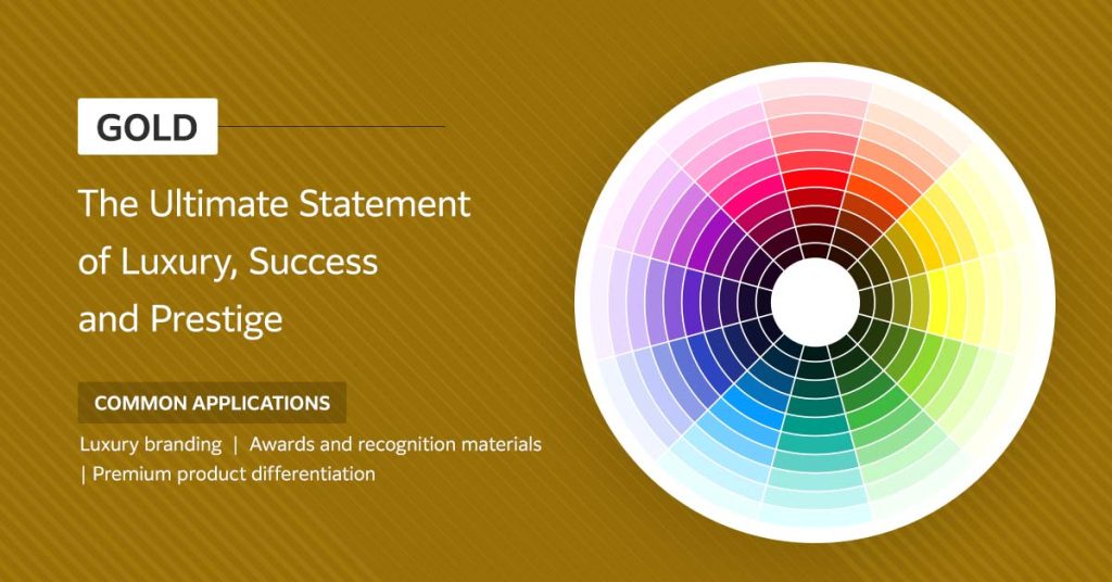
Strategic applications of gold in graphic communication:
Orange is red’s friendlier, more playful cousin. It’s a blend of red’s energy and yellow’s happiness, creating a sense of enthusiasm, warmth and adventure. If your client wants to convey confidence and approachability at once, orange is your ally. Since orange represents comfort, it makes a brand feel less formal and more accessible.
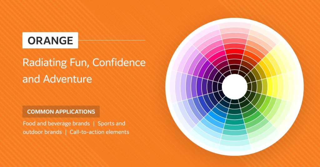
When it comes to marketing, orange symbolism isn’t subtle. It is highly visible, making it effective for drawing attention. However, there’s a balance to strike.
It’s common to find vibrant orange used for:
In high-end branding, black conveys sophistication, elegance and authority. It’s the color of tuxedos, luxury car interiors and premium tech devices. Black doesn’t try to impress — it is simply impressive.
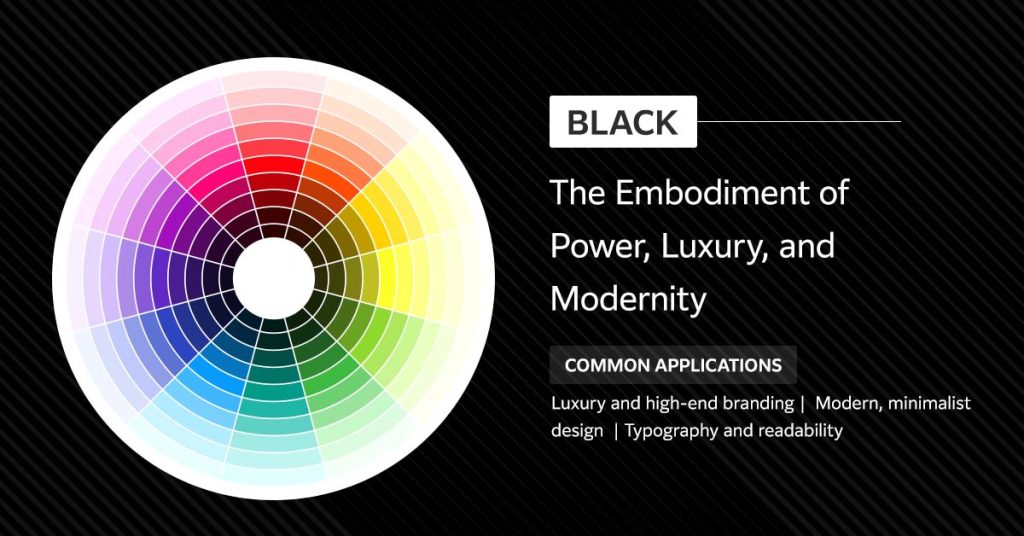
Black symbolism is rooted in contrast and drama. It commands attention not by shouting, but by creating negative space that makes everything around it pop. Black is also inherently mysterious. It conceals as much as it reveals, giving brands that use black an air of intrigue and depth. Without this hue, most designs would lack structure and readability.
Some powerful applications of this timeless color include:
Black is a color of strength, and it never goes out of style.
White represents openness and calm. It’s the color of fresh starts and new beginnings — pristine, unblemished, pure. In design, white symbolizes clarity, honesty and sophistication. It’s the cornerstone of minimalist design, allowing other elements and colors to breathe and stand out.
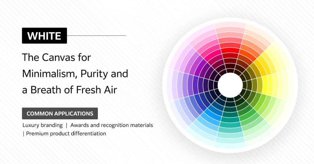
But white isn’t passive. Strategic use of white space is one of the most powerful design tools you have. It directs the eye, creates hierarchy and communicates that a brand is confident enough to let its message speak for itself without clutter.
Here are some common applications where the beauty of white shines through:
Brown is a color that represents reliability and warmth. It’s the hue of rich soil, aged leather and weathered barn wood. Where other colors shout for attention, brown whispers dependability.
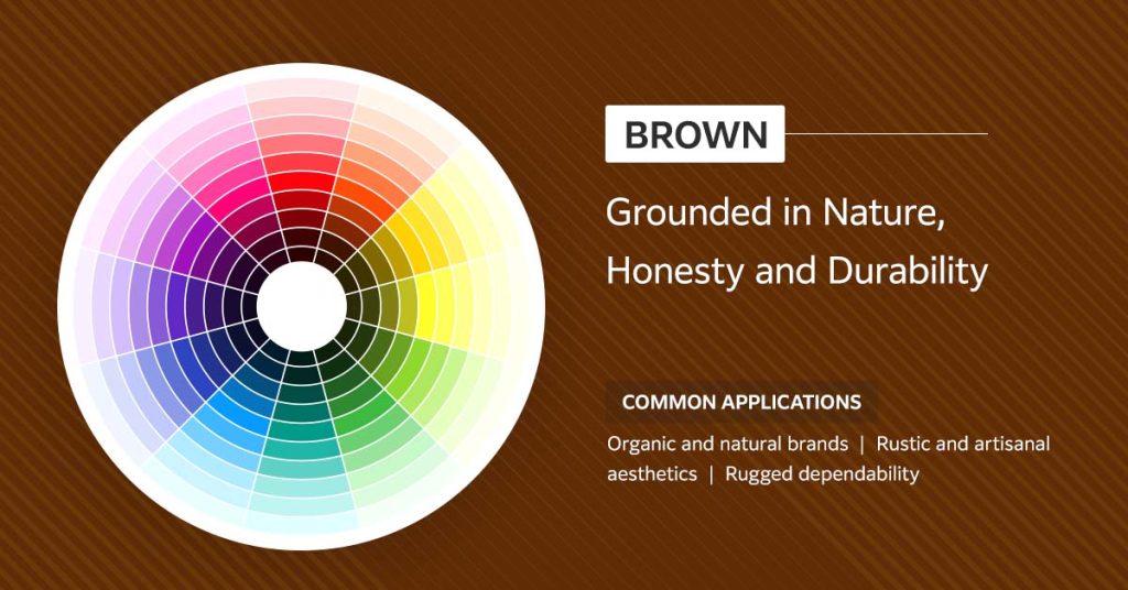
In branding, brown communicates honesty and down-to-earth values. It’s the color choice for brands that want to feel genuine, unpretentious and connected to tradition or craftsmanship.
Some common use cases for the color brown include:
All the color psychology knowledge in the world means nothing if you can’t reproduce those strategic colors accurately on the final product.
Maybe you’ve experienced this issue. A client approves a perfect shade of corporate blue on their screen, one that communicates exactly the right level of trust. Then the print run comes back looking different. Maybe it’s too light, too dark or the color is just off. And just like that, the intentional psychological impact is gone.
Common color reproduction problems include:
This inconsistency frustrates you, your client and your team. It undermines brand trust and weakens the emotional message you worked so hard to establish. That’s where a standardized approach to color management becomes essential.
You now understand the psychology and meaning of colors. Next, you need the tools to make those colors more consistently, more reliably and more profitably.
At Fujifilm, we’ve built our reputation on helping print professionals like you make more with color. Here’s how we do it.
Achieving a specific psychological effect requires hitting a precise shade. And that precision starts with the quality of your consumables.
Not all inks are created equal. Inferior inks can shift in hue, fade over time, or produce inconsistent results from batch to batch. That’s not just a technical problem — it’s a business problem. When your red isn’t quite red enough, you’re not delivering urgency. When your blue looks washed out, you’re not building trust.
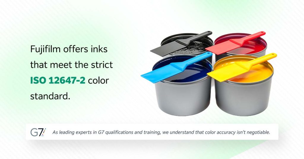
Fujifilm offers inks that meet the strict ISO 12647-2 color standard. As leading experts in G7 qualifications and training, we understand that color accuracy isn’t negotiable. Our inks are engineered to deliver consistent, vibrant results that hold up over time and across substrates.
Each one of your devices sees color slightly differently. Without a centralized system to align them all, you’re constantly chasing consistency. This is where ColorPath SYNC comes in. This cloud-based software is your command center for color management. It allows you to align all your output devices to a single color target, so that what the designer envisioned is what gets printed — no matter which press or printer you’re using.
ColorPath SYNC uses spectrophotometers connected via USB to quantify color data from print samples. That data gets uploaded to the cloud, enabling remote profiling, device calibration and centralized color management across your entire operation. You can monitor and adjust from anywhere, ensuring that every device speaks the same color language.
This level of control isn’t just convenient. It’s what enables you to meet professional standards, such as G7® certification.
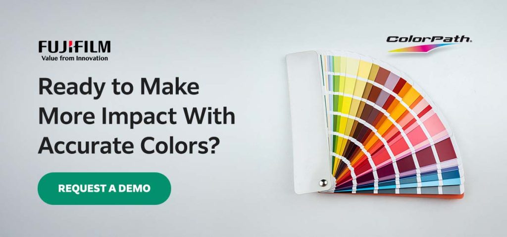
Armed with knowledge about color psychology and the right solutions, it’s time to make your clients’ visions a reality.
At Fujifilm, we understand the pressure to deliver consistent, breathtaking color across every substrate, press and run. Our solutions, including our high-quality inks and ColorPath SYNC software, help you do just that.
Ready to explore the world of color with confidence? Contact us today.